Welcome to our guide on mastering the ninjatrader chart. Whether you're just starting out or looking to sharpen your skills, understanding how to read and use charts is key in the trading world. Charts are like a map for traders, showing past price movements and helping to predict what might happen next. We'll walk through the basics, explore different chart types, and show you how to use indicators and patterns to make smarter trading choices. Let's get started and make your ninjatrader chart experience more effective.
Key Takeaways
- The ninjatrader chart is a vital tool for technical analysis, displaying price and time data to help traders visualize market history.
- Different chart types, like candlesticks and bars, offer unique perspectives on price action, aiding in pattern recognition.
- Technical indicators, such as moving averages and MACD, provide insights into trends and momentum, helping to confirm trading signals.
- Recognizing common chart patterns can offer predictive insights into potential future price movements.
- Effectively using a ninjatrader chart involves integrating various tools, managing risk with clear levels, and adapting strategies to market changes.
Understanding Ninjatrader Chart Fundamentals
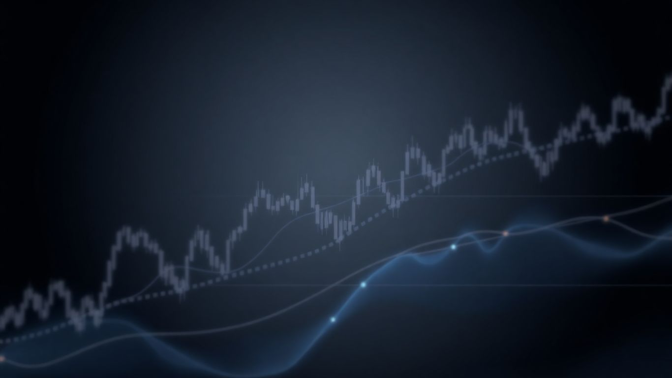
Charts are the bedrock of technical analysis, acting as a visual diary of market activity. They translate complex price and time data into a format that traders can easily interpret. Think of them as a map; without understanding the map, you're just wandering aimlessly. Ninjatrader provides a robust charting platform that allows traders to visualize price action, identify trends, and spot potential trading opportunities. Getting comfortable with these charts is the first step toward making more informed trading decisions.
The Role of Charts in Technical Analysis
In technical analysis, charts are not just pretty pictures; they are the primary tool for understanding market behavior. They display historical price movements, volume, and other data points, allowing traders to identify patterns and trends. The core belief is that past price action can offer clues about future price movements. By studying these visual representations, traders aim to predict where the market might go next. It's about reading the story the market is telling through its price history. The more effectively you can read a chart, the better equipped you are to anticipate market shifts.
Interpreting Price and Time Axes
Every chart has two main axes: the vertical (Y-axis) representing price, and the horizontal (X-axis) representing time. Understanding how these axes work is key to interpreting the information presented. The price axis shows the range of prices a security has traded within a given period, from the lowest low to the highest high. The time axis shows the progression of trading sessions, whether it's minutes, hours, days, or weeks. The scale of these axes can significantly impact how a chart looks and how trends appear. For instance, a shorter timeframe might show a lot of volatility, while a longer timeframe might reveal a more stable trend. Being able to switch between different timeframes and understand what each represents is vital for a complete market view. Learning to read these basic chart elements is a good start for any trader looking to understand futures trading charts.
Key Chart Types for Traders
Ninjatrader supports several chart types, each offering a slightly different perspective on price action. The most common ones include:
- Line Charts: These are the simplest, connecting closing prices over a period with a single line. They're good for a quick overview of the general trend but lack detail.
- Bar Charts (OHLC): Each bar represents a trading period and shows the Open, High, Low, and Close prices. They provide more information than line charts, showing the trading range for that period.
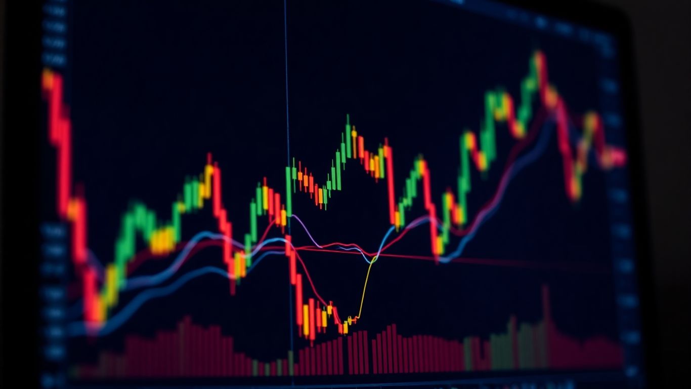
- Candlestick Charts: These are perhaps the most popular. Like bar charts, they show OHLC, but they use a 'body' and 'wicks' to visually represent the price range and the relationship between the open and close. Candlesticks can offer quick visual cues about market sentiment.
Choosing the right chart type depends on your trading style and what information you prioritize. Many traders find candlestick charts to be the most informative for identifying patterns and potential trading signals.
Navigating Ninjatrader Chart Patterns
Charts are like the language of the market, and patterns are the words and sentences that tell a story. For traders, recognizing these patterns is like learning to read that language, offering clues about where prices might head next. It's not about magic, but about understanding historical price movements and how they tend to repeat. By spotting formations like head and shoulders, triangles, or flags, traders can get a sense of potential continuations or reversals in market trends. This can be a huge time-saver compared to manually drawing every line and identifying every potential setup. Tools that automate this process can be incredibly helpful, especially when you're trying to keep up with fast-moving markets. For instance, the Auto Chart Patterns indicator can highlight these formations directly on your chart, saving you the effort of constant manual analysis. This allows more time to focus on refining your strategy or managing risk, rather than just hunting for patterns. It's a way to bridge the gap between seeing a chart and understanding what it might be signaling about future price action.
Identifying Classic Chart Formations
Classic chart patterns are recurring shapes that appear on price charts, believed by many traders to predict future price movements. They are essentially visual representations of market psychology, showing the ebb and flow of buying and selling pressure. Some of the most commonly recognized patterns include:
- Continuation Patterns: These suggest that the existing trend is likely to continue after a brief pause. Examples include:
- Flags and Pennants: Short-term patterns that form after a sharp price move (the 'flagpole'), indicating a temporary consolidation before the trend resumes.
- Triangles (Ascending, Descending, Symmetrical): These patterns show a period of consolidation where price action narrows, often preceding a breakout in the direction of the prior trend.
- Reversal Patterns: These patterns signal a potential change in the direction of the prevailing trend. Key examples are:
- Head and Shoulders (and Inverse Head and Shoulders): A pattern with three peaks, where the middle peak (the head) is higher than the other two (the shoulders). A break below the neckline suggests a downtrend.
- Double Tops and Double Bottoms: Formed after a price fails to break through a certain level twice, suggesting a potential reversal. A double top looks like a 'W', while a double bottom looks like an 'M'.
Understanding these formations is a core part of technical analysis. They provide a framework for anticipating market behavior, helping traders make more informed decisions about entries, exits, and stop-loss placements. It's about recognizing the 'story' the price is telling.
Notable Patterns Shaping Market Trends
Certain chart patterns have a reputation for being particularly reliable in signaling significant market shifts. While no pattern is foolproof, some have stood the test of time and are closely watched by traders worldwide. For example, patterns like the 'Death Cross' (when a short-term moving average crosses below a long-term one) are often seen as bearish signals, suggesting a potential downtrend. Conversely, patterns that form after periods of accumulation or distribution can indicate the start of a new trend. The key is not just to identify the pattern but to understand the market context in which it appears. For instance, a bullish pattern appearing after a long downtrend might carry more weight than the same pattern forming in a choppy, directionless market. This is where tools that can automatically identify and label these patterns, like those offered by Lune Trading, can be a real advantage, helping traders stay focused on the bigger picture and potential trading opportunities.
Leveraging Patterns for Predictive Insights
Once you've identified a chart pattern, the next step is to use it to make a trading decision. This involves more than just seeing the shape; it's about understanding the implications for price action. For instance, with a bullish continuation pattern like a flag, traders might look for a breakout above the upper trendline of the flag with increased volume as a signal to enter a long position. The potential price target is often estimated by measuring the height of the preceding price move (the flagpole) and projecting that distance from the breakout point.
Here’s a simplified approach to using patterns for predictions:
- Identify the Pattern: Recognize a classic formation (e.g., ascending triangle, head and shoulders).
- Determine the Implication: Is it a continuation (trend likely to keep going) or a reversal (trend likely to change)?
- Set Entry and Exit Points: Based on the pattern's rules, define where you might enter a trade and where you'd place your stop-loss to limit risk.
- Project Price Targets: Use the pattern's geometry to estimate potential profit targets.
It's important to remember that patterns are not guarantees. They are probabilistic tools that suggest potential outcomes. Always combine pattern analysis with other forms of technical analysis, such as indicator readings or volume analysis, and never risk more than you can afford to lose on a single trade.
By integrating pattern recognition with other analytical tools, traders can build more robust trading plans. For example, if a bullish pattern appears and is confirmed by a positive reading from a momentum indicator, it strengthens the case for a potential upward move. This layered approach helps in filtering out weaker signals and focusing on higher-probability setups.
Essential Ninjatrader Chart Indicators
Indicators are like your trusty sidekicks in the trading world. They don't predict the future, but they sure do give you a better idea of what might be happening under the hood of the market. Using them can help you make smarter moves, whether you're just starting out or you've been at this for a while. It's not about using a million different ones; it's about picking a few that make sense for how you trade and understanding what they're telling you.
Moving Averages for Trend Smoothing
Think of moving averages as a way to smooth out all the choppy price action you see on a chart. They take the average price over a set period, like 10 days or 50 days, and draw a line. This line helps you see the bigger picture – is the price generally going up, down, or sideways? It cuts through the daily noise.
- Simple Moving Average (SMA): This is the most basic. It just averages the closing prices over your chosen period. Easy peasy.
- Exponential Moving Average (EMA): This one is a bit more sensitive to recent price changes. It gives more weight to the latest data, so it reacts faster to new information. Many traders prefer EMAs because they feel more current.
When the price is consistently above a moving average, it often suggests an uptrend. If it's below, it might be a downtrend. Watching how the price interacts with these lines can give you clues about the market's direction.
MACD for Momentum and Trend Direction
The Moving Average Convergence Divergence (MACD) is a really popular indicator because it does two things: it shows you the trend's direction and its momentum. It's basically made up of two moving averages – a faster one and a slower one – and a signal line.
- MACD Line: This is the difference between a 12-period EMA and a 26-period EMA. It's the main driver of the MACD.
- Signal Line: This is a 9-period EMA of the MACD line itself. It helps to smooth out the MACD line and generate signals.
When the MACD line crosses above the signal line, it's often seen as a bullish signal, suggesting the momentum is shifting upwards. If it crosses below, it can be a bearish signal. It's also useful to look at the histogram, which shows the difference between the MACD and signal lines – growing bars can indicate increasing momentum.
MACD is great for spotting shifts in momentum, but it's best used in trending markets. In choppy, sideways markets, it can sometimes give off false signals.
Leading Indicators for Early Warnings
Leading indicators are the ones that try to give you a heads-up about what might happen before it actually does. They're not perfect, of course, but they can be super helpful for getting ahead of potential market moves.
- Relative Strength Index (RSI): This is a momentum oscillator that measures how fast and how much prices are changing. It swings between 0 and 100. When the RSI goes above 70, the asset might be considered 'overbought' – meaning it could be due for a pullback. If it drops below 30, it might be 'oversold' and could be due for a bounce. It's a good way to spot potential turning points.
- Stochastic Oscillator: Similar to the RSI, the Stochastic also looks for overbought and oversold conditions. It compares a security's closing price to its price range over a specific period. Divergences between the Stochastic and price action can sometimes signal a trend reversal.
Using these indicators can help you identify potential entry or exit points before they become obvious to everyone else. It's about trying to catch the wave early. At Lune Trading, we believe in providing traders with tools that offer these kinds of predictive insights, helping you stay a step ahead in your trading journey.
Advanced Ninjatrader Chart Techniques
Moving beyond the basics of chart patterns and standard indicators can really give you an edge. This section is all about digging into some more sophisticated ways to use Ninjatrader charts to your advantage. We're talking about combining tools, using automation, and tweaking settings to get the most precise signals possible.
Integrating Multiple Indicators
Look, relying on just one indicator is like trying to navigate a maze with only one turn to check. It's not going to get you very far. The real power comes when you start layering different types of indicators. Think about combining a trend-following indicator, like a moving average, with a momentum indicator, such as the MACD. This can help you confirm signals. For example, if your moving average shows an uptrend and your MACD is also showing bullish momentum, that's a much stronger signal than either one would give you on its own. You can also add oscillators like the RSI to see if a security is overbought or oversold, which can help you time entries and exits better. It's about building a confluence of signals, where multiple indicators are pointing to the same potential move. This approach helps filter out weaker signals and increases the probability of a successful trade. It takes practice, but building a system like this can make your trading much more consistent.
Automated Pattern Recognition Tools
Manually spotting chart patterns can be time-consuming, especially in fast-moving markets. That's where automated pattern recognition tools come in handy. These tools can scan charts and identify classic formations like head and shoulders, triangles, or flags for you. They often draw the patterns directly on your chart and can even suggest potential price targets. This saves a ton of time and helps you catch patterns you might have otherwise missed. For instance, the Auto Chart Patterns indicator can automatically detect and display various formations, freeing you up to focus on strategy rather than just pattern hunting. It's like having a helpful assistant who's always on the lookout for setups that traders have used for ages to predict where prices might go next.
Customizing Indicator Settings
Don't just accept the default settings on your indicators. Most platforms, including Ninjatrader, allow you to tweak these settings to better suit your trading style and the specific markets you're trading. For example, you can adjust the lookback periods for moving averages or change the sensitivity of oscillators. Experimenting with these settings is key. You might find that a shorter moving average works better for day trading, while a longer one is more suitable for swing trading. It's also important to remember that markets change. What worked last month might not work today. So, it's a good idea to check your indicator settings now and then and adjust them if the market conditions shift significantly. Keeping your analysis sharp means staying adaptable. This is where services like Lune Trading can offer insights into optimizing these settings for various market conditions, helping you fine-tune your approach for better results.
Applying Ninjatrader Charts to Trading Decisions
Making smart choices in trading hinges on understanding what the charts are telling you. It's not just about looking at pretty pictures; it's about using that visual information to guide your actions. Think of Ninjatrader charts as your map and compass in the often-unpredictable financial markets. They show you where you've been, and with a bit of practice, they can help you figure out where you might be going.
Entry and Exit Strategies with Chart Insights
When you're looking to get into a trade or get out of one, charts can offer some really clear signals. You're essentially trying to catch a trend when it's just starting or get out before it reverses. For example, seeing a stock break above a resistance level on good volume might signal a good time to buy. Conversely, if the price starts falling below a support level, it could be a cue to sell. It's about finding those moments where the market's direction seems to be confirming your idea. Many traders find that using tools like technical analysis can really help pinpoint these moments. It’s not about guessing; it’s about reading the story the price action is telling you.
Managing Risk with Chart Levels
Risk management is a huge part of trading, and charts are your best friend here. You can use specific price points on the chart to set your limits. For instance, you might place a 'stop-loss' order just below a support level. If the price drops to that level, your trade is automatically closed, limiting your potential loss. On the flip side, you can set 'take-profit' levels at resistance points. This helps you lock in gains before the price potentially turns around.
Here’s a simple way to think about it:
- Support Levels: These are price floors where buying interest is strong enough to stop prices from falling further. They are good places to consider setting stop-loss orders.
- Resistance Levels: These are price ceilings where selling pressure is strong enough to prevent prices from rising further. They can be good targets for taking profits.
- Trendlines: Drawing lines that connect a series of higher lows (uptrend) or lower highs (downtrend) can help you visualize the market's direction and potential turning points.
Using these defined levels helps take the emotion out of trading. You're not making decisions on the fly based on fear or excitement; you're following a plan based on what the chart shows.
Analyzing Historical Data on Ninjatrader
Ninjatrader gives you the ability to look back at a lot of historical data. This isn't just for fun; it's incredibly useful. By studying how prices behaved in the past, you can see recurring patterns and understand how different market conditions affected price movements. Did a certain indicator give a buy signal before a big rally? Did a specific chart pattern precede a sharp decline? Looking at this history helps you build confidence in your strategies and refine them. It’s like studying past games to prepare for the next match. At Lune Trading, we believe that understanding this historical context is key to developing robust trading systems, and Ninjatrader provides a solid platform for that deep dive.
Optimizing Your Ninjatrader Chart Experience
So, you've spent time understanding the basics, you're getting the hang of patterns, and you've even started playing with indicators. That's great! But how do you really make your Ninjatrader charts work for you, day in and day out? It's not just about having the charts open; it's about using them smartly. Think of it like having a fancy tool – you need to know how to wield it properly to get the best results.
Effective Usage Tips for Optimal Results
It's easy to get lost in the sea of data on a chart. The trick is to keep things focused. Don't try to use every single indicator or pay attention to every tiny wiggle. Instead, pick a few tools that make sense for your trading style and stick with them. It's better to deeply understand two or three indicators than to have a shallow knowledge of ten.
- Be Selective: Don't chase every signal. Always ask yourself if a signal fits with the bigger picture you see on the chart and with your overall trading plan.
- Consistency is Key: Once you find indicators and settings that work for you, try to stick with them. Constantly switching things up can lead to confusion and missed opportunities.
- Keep it Simple: Avoid cluttering your charts. Too many indicators can lead to 'analysis paralysis,' where you have so much information you can't make a decision.
The goal is to simplify your trading, not complicate it further. A clean chart with a few well-understood tools is often more effective than a wall of data.
Setting Up Alerts for Precision Triggers
Nobody can stare at a screen all day, every day. That's where alerts come in handy. Ninjatrader lets you set up notifications for specific price levels or when certain indicator conditions are met. This means you can step away from your desk without missing a critical move.
Imagine you're watching a stock approach a key resistance level. You can set an alert to notify you when the price hits that level. Or, if you're using an indicator that signals a potential buy, you can get an alert when that signal appears. This frees up your time and helps you react faster when opportunities arise.
Adapting to Changing Market Conditions
Markets aren't static; they change. What worked last month might not work as well today. It's important to periodically review your chart setups and indicator settings. Are the trends still the same? Has volatility increased or decreased? Adjusting your approach based on current market conditions is a sign of a smart trader.
This is where tools that can adapt become really useful. For instance, some advanced indicator suites, like those offered by Lune Trading, use AI to adjust their analysis based on real-time market shifts. This kind of adaptability can give you an edge, helping you stay on the right side of the market even when things get choppy. It's about staying flexible and making sure your charts are always giving you the most relevant information.
Want to make your NinjaTrader charts work better for you? We can help you set things up so you spend less time fiddling and more time trading. Discover how to improve your trading setup today by visiting our website!
Wrapping Things Up
So, we've gone through a lot about using NinjaTrader charts, from the basics to some more involved stuff. It's not always easy, and sometimes it feels like you're just staring at a bunch of lines, right? But remember, the more you practice and play around with the tools, the more sense it'll start to make. Don't expect to be a pro overnight; nobody is. Just keep at it, try out different settings, and see what clicks for your own trading style. The market is always changing, so staying curious and willing to learn is probably the most important thing you can do. Good luck out there!
Frequently Asked Questions
What exactly is a trading chart and why is it important?
Think of a trading chart like a storybook for the stock market. It shows you what happened with a stock's price over time. By looking at these charts, traders can see patterns and figure out if the price might go up or down. It's super important because it helps traders make smarter choices about when to buy or sell.
How can I understand the different types of trading charts?
There are a few main kinds of charts, like line charts, bar charts, and candlestick charts. Candlestick charts are really popular because they show you not just the start and end price for a time period, but also the highest and lowest prices. Learning to read these different types helps you get a better picture of what the market is doing.
What are some common chart patterns traders look for?
Traders watch out for specific shapes on charts that often show what might happen next. Some common ones are 'Head and Shoulders,' which can signal a change in trend, or 'Triangles' and 'Flags,' which can show that a trend might continue. Spotting these patterns can give traders clues about future price moves.
What are technical indicators and how do they help?
Technical indicators are like special tools that traders use. They are math formulas based on a stock's past price and trading volume. These tools can help traders see trends, figure out if a stock is being bought or sold too much, and give signals about when to buy or sell. They add more information to what you see on the chart.
Can I use multiple indicators at once for better analysis?
Yes, absolutely! Using more than one indicator can give you a fuller understanding of the market. For example, you might use one indicator to see the main trend and another to see if the stock is overbought or oversold. When several indicators agree, it often makes a trading signal stronger.
How do I use charts and indicators to make actual trading decisions?
Charts and indicators help you decide when to get into a trade (entry) and when to get out (exit). For instance, a chart pattern might suggest a good time to buy, and an indicator might confirm it. You also use them to set 'stop-loss' points to limit how much money you could lose and 'take-profit' points to decide when to sell and make money.